Is your website layout optimized for phone or mobile device?
We've experienced big changes in the way we work and live. So, more and more of us are using our phones instead of our desktop computers to view websites. That's why it's so important to make sure your site layout looks great and functions well when viewed this way. Mobile-first designing is a smart solution.
Eat a frog first thing in the morning.
In following Mark Twain's advice, it's often recommended you address the most challenging thing first. When designing your layout, it's best to start with the phone, because that's the most challenging space to fit all your content. You'll also find it easier to adapt your mobile design — to the desktop afterward — rather than the other way around.
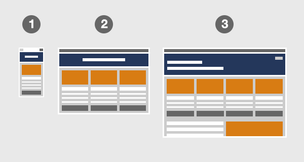
start with thoughtful design.
Phone or Mobile Device
Laptop or Tablet Device
Desktop or Large Screen Device
Content is king.
After you've determined the type of content your audience needs, organize it hierarchically. What's the most important information to address? Sort it into primary, secondary and tertiary content. You can conduct a simple card-sorting exercise to determine this. Make sure the content tells a story so the customer can complete their tasks throughout the journey. Outline the interactive steps and a 'call to action' the user will take to be successful.
Everything in its place.
There may not be a place for all your content. Determine what stays and what goes. Aspire to a simple and clean design by editing wisely, aligning content elements on a grid, and applying the rule of thirds. Use a website builder like Squarespace, WIX, or Showit — allowing you to preview your work on both desktop and mobile — while you design. This will show you how the layout is responding to the devices. Consider which tertiary content to keep for the desktop view.
A sight for sore eyes.
Practicing adaptive design methods will enable you to add more detail for tablet and even more for desktop. Review and test all views with your potential audience before publishing the site. When all is said and done, the customer journey should be functional, and your screen layouts should be beautiful. The result should look good and work well on any device. Your responsive site will delight your audience and build brand loyalty.
#userexperience #phone #mobile #device #tablet #desktop #website #solution #content #hierarchy #journey #tasks #cta #thirds #grid #builder #beautiful #functional #adaptive #responsive #layout #business #brand #branding #brandidentity #loyalty #delight #empathy
need further help?
Book a complimentary 30-min call to discuss your website and business needs.
About the author
Bruce Fenske is an award-winning design strategist, creative director, and entrepreneur. He received a personal letter of thanks from former Microsoft CEO for his information design, created a successful event brand for the CEO and his executive team, and was granted a U.S. Patent for user experience on a heart surgery lab analytic tool at GE Digital.
Today Bruce helps grow businesses by providing brand design solutions and digital experiences that are designed for their audience — including brand identity, brand refresh, brand stewardship, mobile/web design, and other visual solutions.
Bruce is successful by applying his balanced brain — creative yet analytical — to solving problems, his strong advocacy for customers, ability to bring out the best in others, and hands-on design chops.
See more of his creative work at brucefenske.com.