Is your website layout clean or cluttered?
Filling up every inch of every page on your website is tempting. However, the unused areas of the page layout are actually just as important as the areas filled with content. Designers call the unused area white space or negative space. Giving attention to space will improve your design, making your website cleaner and easier for your audience to consume.
More doesn't mean better
While it's wise to place your most important content in the first screen view, your audience can only take in so much at once. Logo, tagline, navigation, and call-to-action are most important, but any more than that could overwhelm your audience. It's better to setup a simple journey they can follow, rather than try to tell your whole story up front.
Cleaning up a messy room
Cluttered content is a lot like a messy room. By not designing the layout wisely, it'll look messy and confusing to the viewer. Tidy up your layout by aligning elements on a grid. Apply the rule of thirds when designing your composition. Doing this will help you determine how your content fits into the space. You may find it's time to clean house, simplify your message, and discard some of the content that's less usable.
The air that I breathe
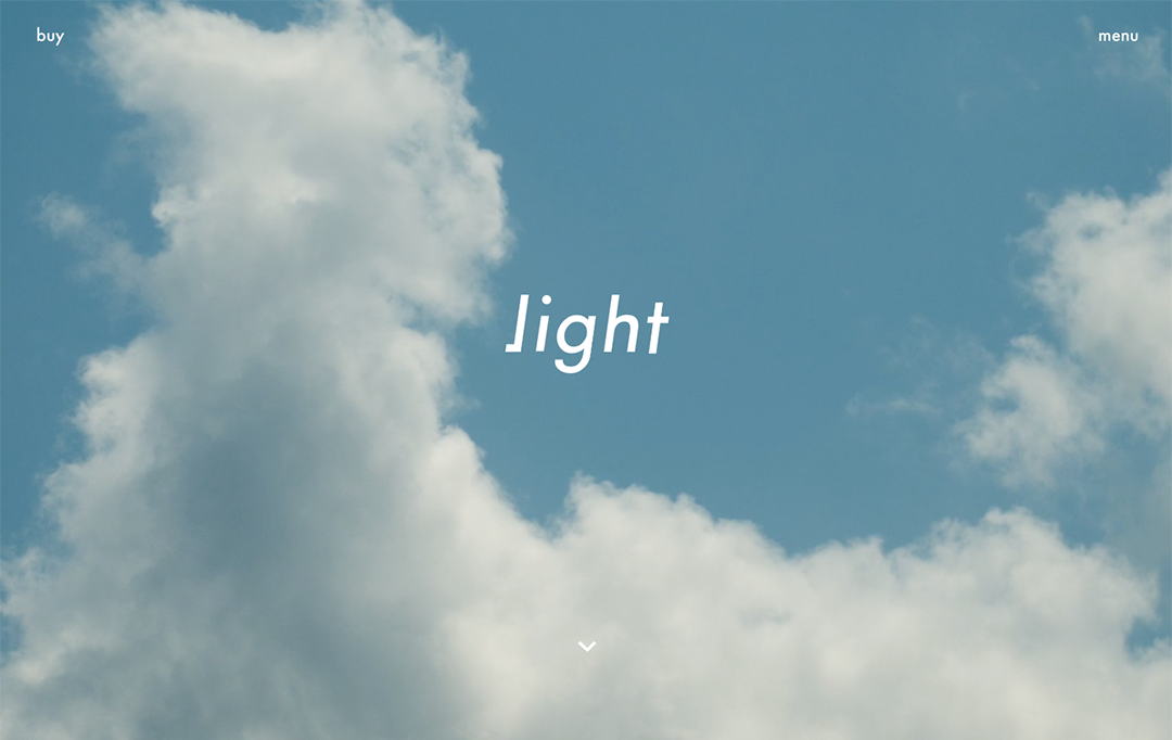
Allow your customer the space to breathe while they consume. Even if a website has a lot of detailed content to offer, it doesn't have to appear complicated. Have you ever noticed the airiness of the popular large sites like Apple or Google? The designers of these sites fought hard to retain space to breathe, and the experience is delightful because of this. For some inspiration, take a look at one of my current favorite sites called Light.
Clean and simple
In the end, a clean, simple experience always outshines a cluttered, complicated one. The design, the fonts, the amount of content, the style of your visuals, and the white space must all be arranged in a way that's pleasing, yet purposeful. You want to invite your audience to engage, help them along their journey, and encourage them to come back for more.
NEED FUrther help?
Book a complimentary 30-min call to discuss your website and business needs.
About the author
Bruce Fenske is an award-winning design strategist, creative director, and entrepreneur. He received a personal letter of thanks from former Microsoft CEO for his information design, created a successful event brand for the CEO and his executive team, and was granted a U.S. Patent for user experience on a heart surgery lab analytic tool at GE Digital.
Today Bruce helps grow businesses by providing brand design solutions and digital experiences that are designed for their audience — including brand identity, brand refresh, brand stewardship, mobile/web design, and other visual solutions.
Bruce is successful by applying his balanced brain — creative yet analytical — to solving problems, his strong advocacy for customers, ability to bring out the best in others, and hands-on design chops.
See more of his creative work at brucefenske.com.
#websites #webdesign #userexperience #userexperiencedesign #layout #clean #cluttered #whitespace #logo #tagline #navigation #cta #journey #story #easy #composition #space #grid #message #content #breathe #simple #pleasing #purposeful #customer #business #audience #engage